Overview
Designing Confidence in an Uncertain Market
When I joined Horizon - one year after COVID, reshaping how companies made product decisions - the platform had traction but no structured user experience. Teams were eager to validate new ideas, yet the workflow designed to help them was fragmented, inconsistent, and difficult to trust.
As the first and only designer, I was brought in to transform Horizon into a cohesive, scalable, and insight-driven product. Over the next seven months, I rebuilt the core flight creation experience, established a design culture from zero, and laid the foundations for a design team that I later led.
What emerged was a platform that not only became easier to use - it became a tool that organisations could rely on to make confident, evidence-based decisions.
The Result?
NPS increased from -2 to 58
Increase in new users in next quarter
Increase in profit margin
Increase in recurring sessions

Challenge
A Powerful Engine With a Fragmented Interface
A “flight” - Horizon’s core concept - is a structured test that measures purchase intent across multiple variants and audiences. But the experience of creating one felt disjointed:
→ Only single-stage tests were supported
→ Landing pages were limited and outdated
→ Domain & DNS setup happened separately per variant
→ Flight overview provided no clarity or readiness signals
→ Data and analytics answered only superficial questions
It wasn’t that any one step was impossible to complete - it was that the steps didn’t feel like they belonged to the same system. The workflow had grown organically without design, creating cognitive friction at every stage.
To be trusted, Horizon needed to feel intuitive, dependable, and strategically aligned with how teams think and make decisions. The redesign needed to bring structure, clarity, and intelligence to an experience that had become fragmented over time.

Context and Role
First Designer in a Post-COVID World
Horizon is a B2B SaaS platform that helps companies test new product ideas using multivariate landing page tests and behavioural data. When I joined, the company had:
No design foundation or UX strategy
No testing pipeline for new features
A complex, confusing core workflow
Growing customer expectations
My role evolved in two phases:
Foundation - Solo Designer (First 6 Months)
I led all design initiatives — from research and strategy to UX, UI, and delivery. I mapped the entire product experience, introduced the first design system, and partnered closely with engineering and service teams to stabilise and standardise the workflow. This phase established the product and UX direction that would allow Horizon to scale.
Scale - Lead Product Designer
As the company grew, I hired and onboarded new designers, established quality standards and design rituals, and directed the roadmap for core product capabilities, including analytics and advanced experimentation models.
This case study focuses on the most strategic initiative from my early contributions: the complete redesign of the flight creation experience.


Step 2
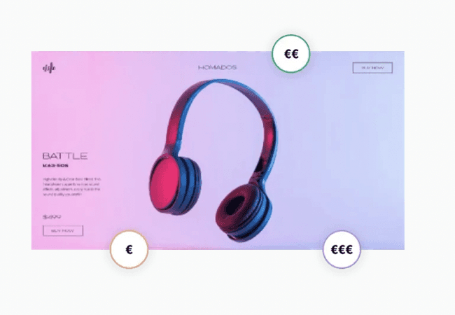
Flight Design
Design the variants of product pages and social media ads, and develop them into high-fidelity consumer touchpoints.
Step 3

Fielding
Run the flight for to collect significant consumer actions, which become visible in real-time on your Horizon dashboards.
Step 4

Insights
Understand consumer decisions based on their behaviour on the experimental landing pages and make a product decision.
How does Horizon run multivariate landing page tests with consumers?
Discovery
Starting from Zero
Because Horizon had never had a designer before, I began by building the understanding from scratch. To map the user journey, I pulled insights from:
Support ticket analysis revealing recurring friction points
Heatmaps and behavioural analytics showing hesitation zones
Client conversations with Bosch, Brita, and Cosnova
Usability sessions with both power users and new users
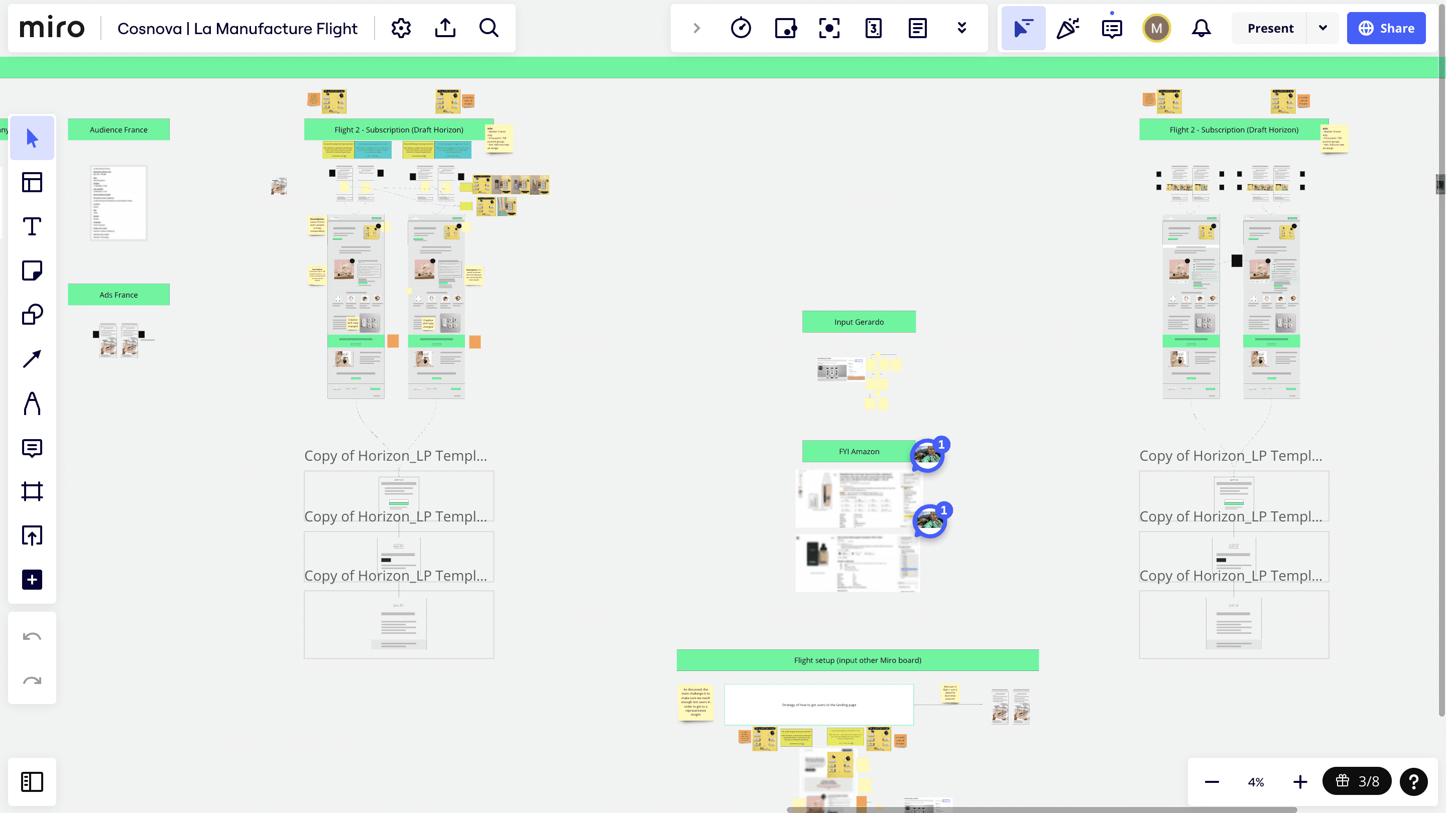
A glimpse into how I worked (my process)




Defining
Making Sense of the Chaos
After synthesising weeks of research, I facilitated cross-functional sessions with engineering, service, and product teams to align on what mattered most.
Together, we distilled the insights into clear problem statements:
No support for multi-stage testing - teams couldn’t analyse behaviour across realistic funnels.
Fragmented configuration - domains, URLs, success pages, and DNS settings lived in different places.
Outdated templates and a limited editor - users spent too long adjusting landing pages.
Confusing flight overview - no sense of progress, readiness, or launch criteria for users.
Shallow analytics - clients couldn’t connect insights to strategic decisions.
These insights led to a guiding design challenge:
“How might we redesign flight creation into a unified, guided, and insight-rich experience that reduces complexity and increases trust?”

Alignment & Exploration
Workshops, wireframes, and early prototypes used to align engineering, service, and product around a unified direction.

Strategy
Designing for Clarity, Scalability, and Trust
The redesign wasn’t about adding features. It was about restructuring the system without breaking trust.
To do this, I defined a guiding principle:
70% Familiar. 30% Horizon Magic.
This balance ensured usability while introducing differentiation.
30% Horizon Magic - Elevating Strategic Value
Once usability was stabilized, I layered in intelligence.
This is where Horizon became differentiated:
• Real-time DNS validation
• Smart defaults based on test logic
• Contextual guidance at decision points
• Visual funnel modeling
• Insight-driven analytics designed for interpretation, not just data display
This transformed flights from functional setups into structured experiments.
The product stopped feeling like a tool -
and started feeling like a decision engine.
This approach allowed us to simplify complexity without limiting long-term experimentation capabilities — ensuring the platform could scale with future product evolution.
Design & Solution
Redesigned Flight Overview
The flight overview became the command center of the journey.
Rather than a static list of settings, it became a dynamic view showing what had been completed, what was pending, and whether the flight was ready to launch (readiness signals, launch criteria).
It clarified next steps, highlighted issues, and gave users a sense of control that had been missing.
This clarity was crucial in building trust in the workflow.
Multi-Stage Test Builder
The shift from single-stage tests to a multi-stage model became the cornerstone of the redesign.
I created a visual builder that allowed teams to add, reorder, and duplicate stages, and structure experiments that mirrored real consumer journeys.
For the first time, users could see their entire test - from qualification to intent - as a cohesive funnel.
This transformed flights into true experiments instead of isolated pages.
Modern Landing Page Editor
The editor was reimagined around modularity and speed.
I introduced smart, reusable components and a refreshed template library tailored to both physical and digital products.
Real-time preview allowed teams to iterate without friction, reducing setup time and eliminating the need for external tools.
The editor became a structured environment that balanced flexibility with consistency.
Unified Domain & DNS Configuration
Domain setup had previously been a complex, technical hurdle.
I simplified this into a single guided flow that handled domains, subdomains, DNS settings, and URLs with real-time validation.
Instead of troubleshooting configuration issues, users moved through a clear, understandable process with confidence.
This step shifted from being one of the most confusing parts of the experience to one of the most straightforward.
Insight-Driven Analytics
I redesigned analytics to focus on interpretation rather than information.
Funnel breakdowns, behaviour mapping, variant comparisons, and clear indicators helped teams understand not only what happened, but why it happened.
This allowed clients to extract real strategic value and tell a coherent story about their experiment results - something the previous dashboard couldn’t support.
Delivery and Iteration
Once the new experience was shipped, I closely monitored key behavioural metrics and gathered structured feedback from users and the service team. Follow-up UX studies helped surface subtle points of friction and opportunities for refinement. Each improvement - whether a tweak to the editor, a change in the DNS flow, or a new insight in the analytics - was introduced deliberately and tested with users.
This redesign became the foundation for ongoing enhancements across the platform. It supported the introduction of more complex testing models, deeper analytics layers, and automation features that were impossible to consider under the old structure.
Delivery wasn’t a single milestone - it became a continuous rhythm of learning, improving, and expanding what the platform could do.
Reflection
This project shaped my thinking as a design leader. Working as the first and only designer taught me to think systematically, to prioritise foundational logic over superficial improvements, and to build with the future team in mind. It also taught me the cost of reactive feature-building - and the value of stepping back to create a cohesive strategy.
As the team grew, my role shifted from designing every component myself to mentoring designers and ensuring alignment across the product. The experience reinforced that leadership is not about controlling decisions, but about enabling clarity, elevating quality, and maintaining a coherent vision.
The redesign of Horizon’s flight creation experience became more than just a UX improvement - it established a long-term product foundation and a design practice that could scale with the company.