Saudi Awwal Bank (HSBC Group)
Rebuilding a bank people had stopped opening
SAB was first in its market at winning customers and ninth at giving them a reason to come back. I lead the design team that rebuilt the architecture behind 1.5 million monthly users, shipped it, and then corrected it in public when the complaints list told us what we had got wrong.
Industry - Banking
Role - Product Design Manager
Timeline - Apr 2025 - Present
Platform - iOS, Android & Web
Status - On-Going
Read - 10 min
One product. 1.5 million active users.
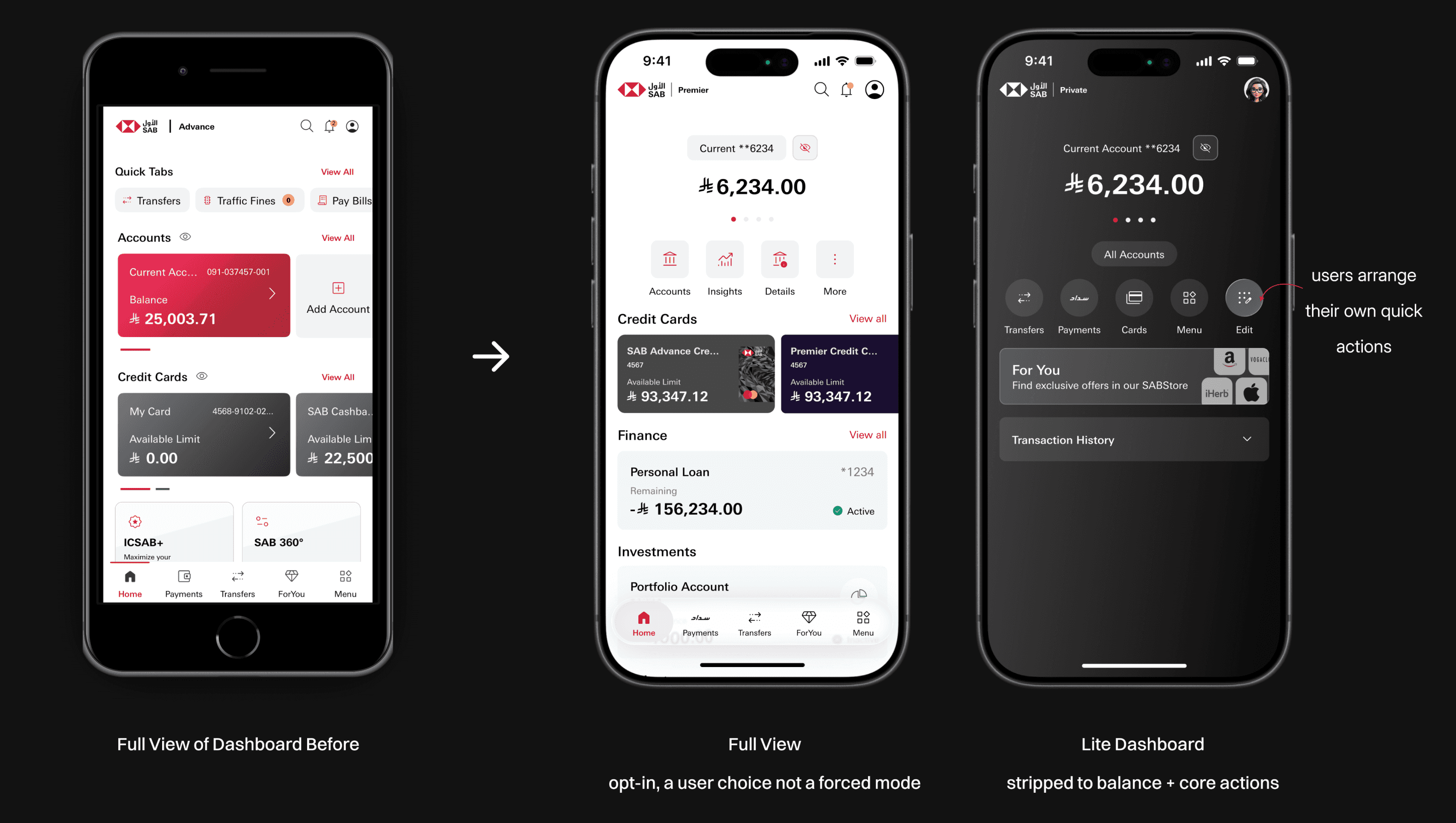
This is how it looks now, after the rebuild. Everything below is what it took to get here.
It did not look like this in April 2025. And the reason it had to change was not the interface.
First in its market at winning customers. Ninth at keeping them.
Two hundred services. Ten visits a month.
SAB is one of Saudi Arabia’s oldest banks and, in 2025, one of its fastest growing. 1.74 million retail customers. More than two hundred digital services. None of it documented, because design had never been resourced to do it.
The bank had commissioned independent benchmarking across ten banks in Saudi Arabia, the UAE and Qatar. I made it the first thing the team read. A design argument built on taste loses inside a bank. One built on a benchmark does not.

First in the market at acquiring customers, at 172 new-to-bank per thousand, 88% of it digital. Third for mobile adoption, ahead of the average for global digital leaders.
Then it fell off a cliff. Ninth for engagement, at 10.6 visits a month against 27.7 for digital leaders, and falling year on year.

Across seventeen journeys measured against global digital champions there was exactly one where SAB came out ahead: closing your account. Opening one scored 33 against 73. It took twenty-two clicks, ten screens and 41 input fields. The strongest bank in the set asked for four.
The bank’s 2028 ambition is to become a life companion. A life companion gets opened twenty-seven times a month. We were being opened ten.
The most services in the market. One of the weakest experiences delivering them.
Saudi retail banking was rebuilding itself. Standing still was the same as falling behind.
Every major bank in the Kingdom was upgrading at once, funded by a national push to move people onto digital channels. In that market, breadth of catalogue stops being an advantage. Everybody has the products. The difference is whether anyone can bear to use them.

Second of ten banks on mobile experience maturity reads well in a board pack. It reads differently next to the leader at 57% against our 40%. We were not being beaten on what we offered. We were being beaten on how it felt to use.
And it looked the part. Large red blocks filled the screens, because red was the brand colour and had been used for everything: the logo, account cards, links, icons, warnings. Product cards came in three unrelated colour treatments depending on which team had built them. There was no semantic system underneath any of it, so nothing on screen told you what mattered more than anything else. Everything was shouting at the same volume.
Nobody opens a life companion twenty-seven times a month if it shouts at them.
That is the part of the brief that gets dismissed as cosmetic and is not. A visual system is how a product tells you what to look at. Ours had lost the ability to say anything.
What the app looked like before
It did not look like one product because it was never built as one
Five years of extension by separate teams, through separate vendors, with nobody arbitrating between them.
SAB Mobile launched in 2020 and grew steadily from there. Cards belonged to one group. Accounts to another. Loyalty to a third. Development sat outside the bank entirely, split across several suppliers, and design had never been resourced to sit above any of it.
Every one of those teams shipped competently. Nobody was deciding what went where, or why.

So the same idea carried three names. Account pages used four icons in a row. The cards screen used a nine-icon grid with no primary action at all. Loyalty used four icons again, but a different four, under a different kind of tab. Card numbers were masked in one place and printed in full in another.
The clearest symptom was the tab bar. In some parts of the app it read Home, Payments, Transfers, SAB 360, Menu. In others it read Home, Payments, Transfer, SAB Store. The single most persistent element in a mobile app changed depending on which team’s section you happened to be standing in.
The interface was a map of the org chart. Every seam between two teams was visible to the customer.
That reframed the job inside my first month. The deliverable was not a set of screens. It was a set of rules about where things belong, plus the evidence and the standing to hold several external suppliers to them.
We mapped every route through the app before redesigning any of it
You cannot decide where something belongs until you know how many places it already is.
I documented the credit cards product end to end myself, every screen, state and branch. Not because I wanted the work, but because a team assembled in four weeks needs a template it can argue with more than a brief it has to interpret. Then each designer took a product area and did the same, and we joined them into a single map of the app.

Six ways to reach an account. Eight to reach a card, one of which was buried inside an account. Five separate places that could freeze a card, most of them behaving slightly differently. Thirteen ways to open an account, once you counted how a deposit could mature. Fourteen ways to make a transfer.
None of that was anyone’s fault. It is what happens when every team adds a door and nobody is responsible for the building.
The map turned opinion into evidence. A review stopped being people saying the app felt complicated and became a designer pointing at a diagram: this action exists in five places and three of them behave differently. That is a very different conversation to have with a supplier who is about to tell you it cannot be changed.

A sneak peak of how the documentation happened (7000+ screens)
Half our customers were failing before they reached the app
Roughly half of SAB’s customers are expats. The reason so many could not open an account was not in the product at all.
I moved to Saudi Arabia to take this job, so I went through arrival myself. Get a SIM, do the medical, wait for the Iqama, register a national address, then open a bank account.
Mine was rejected. So was a friend’s. I asked the expats on my team and every one of them had hit the same wall.

When you land, the only identification you hold is a passport, so your SIM is registered against it. Weeks later the Iqama arrives. The bank checks your mobile number against the Iqama, finds it still tied to the passport, and rejects the application. Nothing explains why.
I asked the customer experience team for complaint volumes on expat account opening. It was one of the largest categories they had, and nobody had filed it as a design problem, because on paper it was not one.
The fix could not live inside the account opening journey. By the time you reach that screen the damage is done. We built a full international banking section before login, mirrored on the public website, walking through what to do from the day you land.
The failure was happening outside our product, so the fix had to live outside it.
Inside the journey we cut what we could reach, pre-filling everything already on file and resequencing the rest. Account opening now completes digitally 98% of the time, up 11.3% year on year, at around twenty-six thousand accounts a month.

International Banking - Guide for Expats in Pre-login Journey
One rule for where everything lives
Hubs for every product category, and the same four tiers underneath every product in the bank.
Hubs first. One destination per product category: accounts, cards, finance, investments. Everything of a type in one place, so there is a single answer to where do I find my cards.

Underneath, four tiers on every product page. Identity and balance. Primary actions. Services grouped by function. History. A current account, a credit card, a multi-currency prepaid card and a finance agreement all carry the same skeleton. One slot in the action row changes.
The rules mattered more than the layout. Does an instalment plan belong on the cards hub or on the card it applies to? On the card, because it is a property of that card and not of all cards. Every question like that had been answered ad hoc for five years by whoever happened to be building at the time. Now there was a written principle a supplier could be held to.
The visual language was rebuilt at the same time, on semantic tokens rather than brand colour applied everywhere, with a dark theme designed rather than inverted. Red went back to meaning one thing. But the refresh was the smaller half of the work. A modern skin over an incoherent structure is just a better looking maze.
Because the people writing the code work for several different suppliers, a Figma library alone was never going to survive contact with them. We built the system in Figma and in Storybook, and it was adopted for launch: 85 components, 533 variants, 576 token values. When design outgrew what we could reasonably hand over, we brought engineers in house to build components and sit between us and the vendors.


Forty-seven fields we were not allowed to delete
The regulator, the suppliers and the release date each got a vote. Most of the job was deciding what we gave up.
The credit card application had 47 input fields, including your full address entered twice, once as residential and again as mailing. The bank already collects and verifies employment, income, expense and personal information when you open an account. So the ideal was obvious: pre-fill it, let the customer correct what changed, get out of the way. We wrote it up and argued for it.

SAMA requires that information to be collected again before a credit application is submitted. So we cut every field regulation did not require, resequenced the rest, and shipped 47 to 21.
Then there is the call. Partway through the application an automated voice call rings you, and you press one to authenticate before you can sign. It was not ours to delete.
What we could control was whether any of it became a dead end. The application now carries ten states, from saved and incomplete through action needed, returned, pre-approved and expired, each with its own way back in. When the call does not arrive there is a route out. When an application is returned, the reason is on the screen rather than in a letter. We could not make it short. We made it survivable.
Credit cards issued end to end through the app are up 79% year on year.
Transfers and payments got the opposite treatment to what the deadline suggested. We designed the North Star journey knowing it could not be built in November, or in February, then worked backwards into a version that could ship and a staged route to the rest. Micro-interactions, motion and several flow improvements the team had designed properly came out of the release, because the supplier effort was not there and the date was not moving.
Telling designers that work they are proud of is not shipping this quarter is the part of the job that never appears in a portfolio.
The revamped journey for new credit card applications - Reduced to 21 fields (mostly pre-filled) - Estimated time less than 5 minutes to choose and apply
Then we handed the same structure to a nine-year-old
Family banking was the bank’s largest new proposition and the real test of everything underneath it.
A child gets a genuine account, not a toy. A multi-currency prepaid card. A savings account with a profit rate, a maturity date and a monthly deduction schedule. Card limits they manage themselves, where reducing the in-store cap pulls the online cap down with it.
And Challenges. A child proposes one, tidy your room, learn a word a month, save towards something, sets the reward, and sends it to their guardian. Nothing starts until it is approved and nothing pays out until it is confirmed.

Structurally, the child’s account is a current account. Same header, same action row, same services, same history. The content is chores and savings goals instead of statements and disputes. The skeleton does not move.
That was the point at which the architecture stopped being a proposal.
1,271 family accounts were opened in a single month.
Same structure but redesigned for kids

We shipped, then the complaint list told us we were wrong
Beta in November, full migration in December. By January we knew three things we had got wrong, including one we had been certain of.
We tested with users in September before launch and again in February after it. In between, our instrument was a spreadsheet.
The analytics sit with our suppliers. What we get is a monthly export and a complaint list from the customer experience team, drawn from in-app feedback, the App Store, Google Play and the call centre. A blunt instrument, and the only one we had, so we learned to read it properly.

Card actions were not where people looked. We had moved virtual card settings onto the virtual card, which is exactly where they belong. Customers could not find them. We put them back into the product page, duplicated deliberately rather than logically, so both entry points now exist. Not elegant. Correct.
Supplementary cards were the right experience and the wrong engineering. Loading them on the credit card page added API calls on every open and performance suffered. We stripped it back to an entry point.
Login became a top-three complaint. This one had been true for years and nobody had counted it. Face ID, Touch ID, quick access and the digital secure key had all existed for a long time, and every one of them shipped switched off, buried in settings behind a page of legal text and a phone call you had to answer. Almost nobody had ever turned any of them on.
A system tells you where a thing belongs. It does not tell you where a person will look. We had only solved one of those.
February and March corrected it in public. Face login moved onto the dashboard, prompted once a day for anyone still typing a password. PIN rules shown before people typed rather than after they failed. A countdown on the verification call. Proper failure states. A plain sentence about what you lose if you turn biometrics off. We built almost nothing new. We changed where it lived and what it explained.
On the hubs, testing split cleanly between people who wanted their products stacked and people who wanted a list. Rather than arbitrate, we shipped both and let people choose.
Face/Touch ID enablement
Where it stands
Nine months after launch, with the corrections shipped.

Through 2025 the team shipped 54 business-as-usual tasks alongside 85 belonging to the rebuild, close to five thousand screens between them. There was never a quiet quarter to do this in, because a bank does not stop shipping while you reorganise it. Every designer owns a product area end to end and sits in QA, which was not a design responsibility here before and which cut how much reached customers broken.
Arabic used to cost a designer hours of manual mirroring every time an issue surfaced in testing. We commissioned a plugin that does it in a few clicks. No customer will ever see it, and it gave the team back about a week a month.
The same architecture and design system are now being applied to corporate banking, website and the web channel.
We moved the structure. The habit comes next.

Drawn from benchmark studies commissioned by the bank, internal performance reporting, usability testing run by the team in September 2025 and February 2026, and the monthly complaint lists.