Saudi Awwal Bank (HSBC)

Re-Architecting a Fragmented Digital Ecosystem

A 50-year-old bank trapped inside a decade of stitched-together screens. I mapped the entire ecosystem — 7,000+ screens — and rebuilt it into one architecture designed to scale for the next decade.

Industry - Banking
Role - Lead Product Designer

Timeline - 1 year

Platform - iOS, Android & Web

Status - On-Going
Read - 15 min

Story
When I joined SAB, what looked like a dated UI revealed something deeper - a fragmented system stitched together over a decade without a coherent architecture. I led the reconstruction of its digital foundation, transforming 7,000+ screens into a unified, scalable banking platform.

On my first day at Saudi Awwal Bank, I opened the mobile app expecting complexity.


What I didn’t expect was red in every direction. Red rectangles. Red highlights. Red cards.


It looked like a product expanded feature by feature without ever being rethought.


But the real problem wasn’t visual.

The red UI was a symptom.


SAB didn’t have one app.

It had several apps stitched together.


And nobody fully understood how many.

On my first day at Saudi Awwal Bank, I opened the mobile app expecting complexity.


What I didn’t expect was red in every direction. Red rectangles. Red highlights. Red cards.


It looked like a product expanded feature by feature without ever being rethought.


But the real problem wasn’t visual.

The red UI was a symptom.


SAB didn’t have one app.

It had several apps stitched together.


And nobody fully understood how many.

Impact at a Glance

The redesign didn’t just modernize the interface - it fundamentally changed how customers and internal teams experienced the bank.

8.5%

Increase in daily active usage

27%

Faster journey completion

4.1 → 4.7

App Store rating

22%

Increase in Cross-Product Engagement

Internally, the transformation was just as powerful as the external one. The bank finally had a shared mental model of its own product.

7000+

Screens consolidated into unified architectural hubs

50%

Decrease in Design–Engineering Clarification Loops

30%

Decrease in QA & Testing Cycles

The Problem Was Structural, Not Visual
SAB didn’t suffer from outdated UI. It suffered from architectural fragmentation.

Every major banking action had multiple entry points.


Debit cards in one place.

Prepaid cards somewhere else.

Credit cards buried inside service folders.

Transfers in three separate sections.

Limits hidden under unrelated menus.

Behind the UI, fragmentation went deeper:


  • Different backend systems powering similar features

  • Vendor-controlled journeys with rigid flows

  • Segment-based visibility altering experiences

  • No documented journey inventory

  • No central taxonomy

  • Duplicated flows behaving differently

This wasn’t poor design taste.


It was the absence of a coherent system.


Users weren’t navigating a banking app.


They were navigating a maze built over a decade.

This wasn’t poor design taste.


It was the absence of a coherent system.


Users weren’t navigating a banking app.


They were navigating a maze built over a decade.

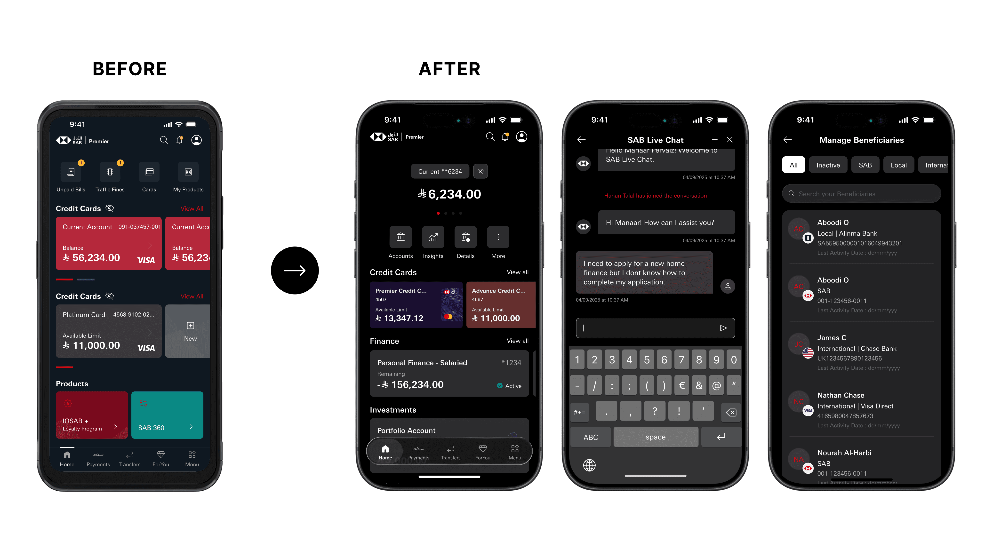
SAB App before the Revamp
I Mapped the Entire Ecosystem - 7,000+ Screens
Before redesigning anything, I documented every screen, branch, and variation across three customer segments to uncover the true system architecture.

Using UAT devices for Mass, Advance, and Premier users, I manually explored:


  • Every flow

  • Every possible branch

  • Every vendor-powered journey

  • Every backend-triggered scenario

  • Every undocumented production-only screen

When consolidated, the mapping exceeded 7,000 screens.


What shocked leadership wasn’t just the number.


It was what it represented.


Hundreds of screens had never been seen by a designer. No documentation existed.


When I presented just the Cards ecosystem mapping, the room went silent.


That was the moment the project stopped being a UI refresh and became an organizational reset.

When consolidated, the mapping exceeded 7,000 screens.


What shocked leadership wasn’t just the number.


It was what it represented.


Hundreds of screens had never been seen by a designer. No documentation existed.


When I presented just the Cards ecosystem mapping, the room went silent.


That was the moment the project stopped being a UI refresh and became an organizational reset.

A sneak peak of how the documentation happened
Designing Inside Banking Constraints
The real challenge wasn’t just structural complexity - it was navigating regulatory and vendor limitations without breaking the system.

Application journeys were vendor-powered.


Reordering steps meant rewriting integrations.


SIMAH required approval for structural changes - even when compliant. Approval cycles could take 2–3 months.


My ideal journeys could take half a year to ship.


That’s when the real challenge became clear:

This redesign wasn’t about designing a better interface. It was about designing a better system within legacy constraints.

From that point forward, every decision operated at two levels:


  • Level 1 — What is ideal?

  • Level 2 — What is feasible?


That dual mindset shaped my leadership at SAB.

From that point forward, every decision operated at two levels:


  • Level 1 — What is ideal?

  • Level 2 — What is feasible?


That dual mindset shaped my leadership at SAB.

Use the prototype to see the app

We Reconstructed the Architecture, Not Just the Screens
The app lacked hierarchy and could not scale horizontally. New features were bolted on rather than integrated.

Similar products had inconsistent patterns.


Debit, credit, and prepaid cards each followed different rules.


Key actions like Freeze Card, View Details, and Change Limit lived in 4 to 5 places.


Navigation was often non-reversible.


Segment logic meant users saw different versions of the same feature.


The system couldn’t support long-term growth.


So instead of redesigning screens, I rebuilt the structure.

Similar products had inconsistent patterns.


Debit, credit, and prepaid cards each followed different rules.


Key actions like Freeze Card, View Details, and Change Limit lived in 4 to 5 places.


Navigation was often non-reversible.


Segment logic meant users saw different versions of the same feature.


The system couldn’t support long-term growth.


So instead of redesigning screens, I rebuilt the structure.

The Hubs Model Unified the Entire Ecosystem
I introduced a Hubs architecture - Accounts, Cards, and Finances - creating predictable entry points and a shared mental model across the ecosystem.

Accounts Hub unified savings, current, global HSBC, and kids accounts under one consistent structure.


Cards Hub redefined what a card meant inside SAB - unifying debit, credit, and prepaid under shared interaction logic.


Finances Hub consolidated personal finance, buyout finance, and micro-lending into one discoverable ecosystem.


This solved fragmentation at its root:


One place per product type.

One navigation logic.

One mental model.


For the first time, SAB functioned as a platform instead of a patchwork.

Accounts Hub unified savings, current, global HSBC, and kids accounts under one consistent structure.


Cards Hub redefined what a card meant inside SAB - unifying debit, credit, and prepaid under shared interaction logic.


Finances Hub consolidated personal finance, buyout finance, and micro-lending into one discoverable ecosystem.


This solved fragmentation at its root:


One place per product type.

One navigation logic.

One mental model.


For the first time, SAB functioned as a platform instead of a patchwork.

Product Pages Became Daily Financial Workspaces
I redesigned product pages into structured financial workspaces users interact with daily.

Previously:


Essential actions were hidden

Layouts were inconsistent

Services were scattered

Information was duplicated or missing

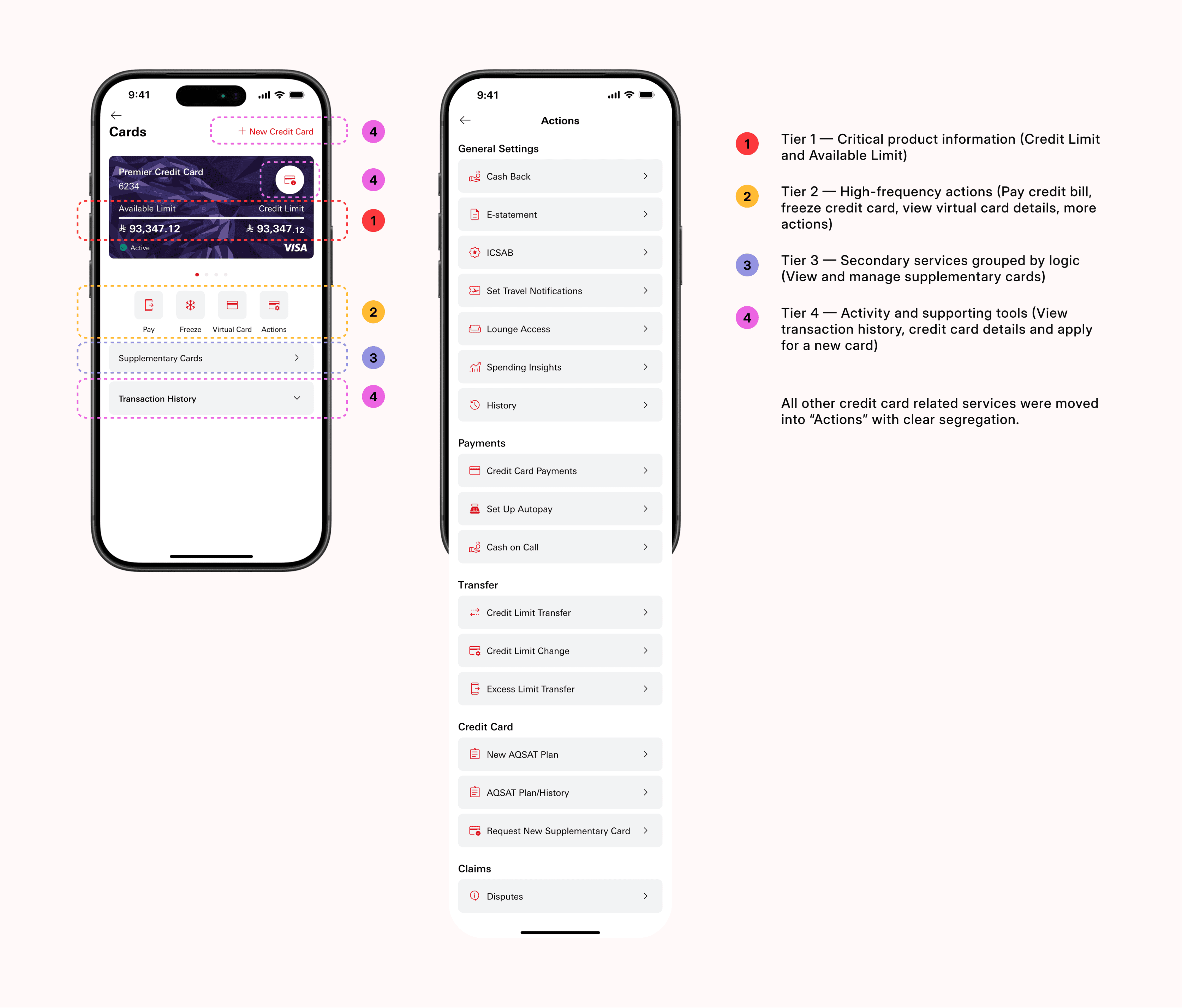
I introduced a universal four-tier structure:


  • Tier 1 - Critical product information

  • Tier 2 - High-frequency actions

  • Tier 3 - Secondary services grouped by logic

  • Tier 4 - Activity and supporting tools


This system worked across accounts, cards, and finances.


Users no longer had to relearn the app for each product.


Cognitive load dropped dramatically.

I introduced a universal four-tier structure:


  • Tier 1 - Critical product information

  • Tier 2 - High-frequency actions

  • Tier 3 - Secondary services grouped by logic

  • Tier 4 - Activity and supporting tools


This system worked across accounts, cards, and finances.


Users no longer had to relearn the app for each product.


Cognitive load dropped dramatically.

The structure held as we pushed past the flagships

Prepaid, virtual cards, and other product and service variants dropped into the same four tiers with no new pattern invented. The test of a system isn't the three products you designed it around - it's the tenth one that just fits.

Family Banking Proved the System Could Scale
Family Banking became the ultimate stress test for the new system - requiring two radically different user experiences to coexist within the same architectural foundation.

On the surface, it seemed like just another feature.


In reality, it required designing two financial worlds.


Parents needed:

  • Full oversight of spending

  • Transaction categorization

  • Allowance scheduling

  • Spending controls

  • Card freeze/unfreeze

  • Request approvals

  • Real-time notifications


Kids needed:

  • Simplicity

  • Clear balances

  • Safe request-money flows

  • Gamified saving

  • Visual guidance

  • Age-appropriate language


We were building one of the first serious youth banking ecosystems in the region.


And the question was simple:

Could the same structural foundation support both control and freedom?

We did not create a separate architecture.


We reshaped interaction patterns on top of the same Hubs logic.


The Cards structure remained consistent.

The Product Page tiers remained intact.

The navigation logic stayed predictable.


Only cognitive load changed.


That decision mattered.


Because if a system can handle extremes - from financially literate parents to first-time banking users aged 8 - it can handle anything.


Family Banking validated that the redesign was not cosmetic. It was architectural.

We did not create a separate architecture.


We reshaped interaction patterns on top of the same Hubs logic.


The Cards structure remained consistent.

The Product Page tiers remained intact.

The navigation logic stayed predictable.


Only cognitive load changed.


That decision mattered.


Because if a system can handle extremes - from financially literate parents to first-time banking users aged 8 - it can handle anything.


Family Banking validated that the redesign was not cosmetic. It was architectural.

The same structure, rebuilt for oversight

The child gets simplicity; the parent gets the same product-page tiers — balance, actions, services, history — now with full visibility and control over every child's account.

Built Structural Layers for the Next Decade
Beyond UI, I created foundational layers to power SAB’s digital future.

Behind the UI, five structural systems were rebuilt:


Information Architecture

We defined a unified taxonomy across accounts, cards, finance, international banking, and support services. Every product had one home. Every service had one logic.


Cross-Journey Framework

Behavior was standardized across flows. Entry points, exit states, error handling, and confirmations followed shared rules. This reduced unpredictability across journeys.


Content Hierarchy

Naming conventions were aligned across mobile, web, and internal documentation. No more “statement” in one flow and “transaction summary” in another.


Segment Logic Governance

Mass, Advance, and Premier segments were mapped structurally - not visually. Experience differences were rule-based and documented.


Component System

A scalable design system supported adults, kids, finance products, global accounts, and new card types - without requiring structural rewrites.


This is what turned SAB into a platform instead of a reactive product.


Before, new features were bolted on.


After, new features had a home.


Architecture creates confidence. Confidence enables innovation.

Behind the UI, five structural systems were rebuilt:


Information Architecture

We defined a unified taxonomy across accounts, cards, finance, international banking, and support services. Every product had one home. Every service had one logic.


Cross-Journey Framework

Behavior was standardized across flows. Entry points, exit states, error handling, and confirmations followed shared rules. This reduced unpredictability across journeys.


Content Hierarchy

Naming conventions were aligned across mobile, web, and internal documentation. No more “statement” in one flow and “transaction summary” in another.


Segment Logic Governance

Mass, Advance, and Premier segments were mapped structurally - not visually. Experience differences were rule-based and documented.


Component System

A scalable design system supported adults, kids, finance products, global accounts, and new card types - without requiring structural rewrites.


This is what turned SAB into a platform instead of a reactive product.


Before, new features were bolted on.


After, new features had a home.


Architecture creates confidence. Confidence enables innovation.

Dark Mode Exposed a Deeper Color Problem
SAB shipped a dark mode that was never actually designed. It was a broken system pretending to be a feature - and fixing it meant rebuilding the color foundation itself.

When I inspected the existing dark mode, the diagnosis was familiar: it wasn't designed, it was inverted. Colors were hardcoded screen by screen. The same grey meant three different things in three different places. Text failed contrast on dark surfaces. And SAB's brand red - saturated and heavy - vibrated against black, turning harsh, hard to read, and impossible to use across large surfaces or text.


It was the same problem as the rest of the app, wearing a different skin: no system underneath.

So I didn't add a dark theme. I rebuilt the color layer from the tokens up.


Instead of raw colors bound to components, I defined a semantic token architecture - tokens named by role, not by value. A surface token. A primary text token. A border token. A danger token. Each mapped to a different value in light and dark, but the component never knew the difference. Design once, theme everywhere.


This solved three problems at once:


Brand integrity: I reworked how SAB red behaved across modes, tuning tints, elevations, and accent usage so the brand stayed unmistakably SAB without burning the eyes on dark surfaces.


Accessibility: Every token pairing was validated for WCAG AA contrast, so legibility held up in both themes instead of collapsing in the darker one.


Scale: Because theming lived in tokens, dark mode propagated automatically across thousands of screens, every hub, every product page, and both the adult and kids experiences - without redesigning a single component twice.


Dark mode stopped being a cosmetic toggle. It became proof that one architecture could carry two complete visual worlds. What Family Banking proved for interaction, color now proved for surface: the system didn't just hold - it scaled into its opposite.

When I inspected the existing dark mode, the diagnosis was familiar: it wasn't designed, it was inverted. Colors were hardcoded screen by screen. The same grey meant three different things in three different places. Text failed contrast on dark surfaces. And SAB's brand red - saturated and heavy - vibrated against black, turning harsh, hard to read, and impossible to use across large surfaces or text.


It was the same problem as the rest of the app, wearing a different skin: no system underneath.

So I didn't add a dark theme. I rebuilt the color layer from the tokens up.


Instead of raw colors bound to components, I defined a semantic token architecture - tokens named by role, not by value. A surface token. A primary text token. A border token. A danger token. Each mapped to a different value in light and dark, but the component never knew the difference. Design once, theme everywhere.


This solved three problems at once:


Brand integrity: I reworked how SAB red behaved across modes, tuning tints, elevations, and accent usage so the brand stayed unmistakably SAB without burning the eyes on dark surfaces.


Accessibility: Every token pairing was validated for WCAG AA contrast, so legibility held up in both themes instead of collapsing in the darker one.


Scale: Because theming lived in tokens, dark mode propagated automatically across thousands of screens, every hub, every product page, and both the adult and kids experiences - without redesigning a single component twice.


Dark mode stopped being a cosmetic toggle. It became proof that one architecture could carry two complete visual worlds. What Family Banking proved for interaction, color now proved for surface: the system didn't just hold - it scaled into its opposite.

Changed How Design Participates in the Organization
Designers were not involved early in BVT testing. That changed.

Design was previously limited to UI validation.


Functional defects were treated as QA responsibility.


I redefined the process:

  • Designers joined early testing cycles

  • Functional issues became shared responsibility

  • Cross-functional reviews were introduced

  • Documentation became embedded into design


This wasn’t just workflow optimization.


It was a cultural shift toward shared ownership.

Design was previously limited to UI validation.


Functional defects were treated as QA responsibility.


I redefined the process:

  • Designers joined early testing cycles

  • Functional issues became shared responsibility

  • Cross-functional reviews were introduced

  • Documentation became embedded into design


This wasn’t just workflow optimization.


It was a cultural shift toward shared ownership.

Delivery Required Precision
We rolled out the redesign in controlled phases to protect stability while accelerating progress.

We designed the rollout in phases:


Beta Release

Controlled exposure to a limited segment allowed behavioral validation without destabilizing production.


Full Migration

Gradual migration ensured backend load stability and reduced customer shock.


Post-Launch Enhancements

Q1 refinements focused on personalization, data-driven optimizations, and usability improvements informed by live metrics.


Unlike startups, banks cannot afford “move fast and break things.”


We had to:

  • Preserve trust

  • Protect compliance

  • Maintain uptime

  • Avoid systemic risk


Every structural decision had operational consequences.


And yet, momentum never slowed.


This was transformation without disruption.

We designed the rollout in phases:


Beta Release

Controlled exposure to a limited segment allowed behavioral validation without destabilizing production.


Full Migration

Gradual migration ensured backend load stability and reduced customer shock.


Post-Launch Enhancements

Q1 refinements focused on personalization, data-driven optimizations, and usability improvements informed by live metrics.


Unlike startups, banks cannot afford “move fast and break things.”


We had to:

  • Preserve trust

  • Protect compliance

  • Maintain uptime

  • Avoid systemic risk


Every structural decision had operational consequences.


And yet, momentum never slowed.


This was transformation without disruption.

Omni-Channel Evolution Began With Mobile
The mobile redesign became the blueprint for SAB’s broader digital ecosystem - including web and future channel expansion.

Before the revamp, mobile and web were inconsistent.


Terminology differed.

Navigation logic differed.

Service grouping differed.


The mobile reconstruction changed that.


Because once architecture was unified:

  • Taxonomy could extend to web

  • Product hierarchy could scale across channels

  • Service logic became transferable

  • Naming conventions aligned across marketing and support


Mobile became the source of truth.


This wasn’t responsive design adaptation.


It was structural alignment across channels.


The same Hubs logic now informs:

  • Web dashboards

  • Marketing landing flows

  • Cross-channel authentication journeys

  • Support documentation


The redesign didn’t just modernize an app.


It established a cross-channel system.

Before the revamp, mobile and web were inconsistent.


Terminology differed.

Navigation logic differed.

Service grouping differed.


The mobile reconstruction changed that.


Because once architecture was unified:

Taxonomy could extend to web

Product hierarchy could scale across channels

Service logic became transferable

Naming conventions aligned across marketing and support


Mobile became the source of truth.


This wasn’t responsive design adaptation.


It was structural alignment across channels.


The same Hubs logic now informs:

Web dashboards

Marketing landing flows

Cross-channel authentication journeys

Support documentation


The redesign didn’t just modernize an app.


It established a cross-channel system.

Switch on to reveal the 'before' - see how far each product has come

Reflection: Redesigning a Bank Is Redesigning How It Thinks
The hardest, most valuable work on this project happened away from the interface - in systems, in constraints, and in people.

This project reshaped how I think about product design.


Clarity is structural. Mapping thousands of screens proved the most impactful changes rarely happen inside Figma. They happen in conversations, in process shifts, in challenging assumptions, in aligning teams around a shared system.

This project reshaped how I think about product design.


Clarity is structural. Mapping thousands of screens proved the most impactful changes rarely happen inside Figma. They happen in conversations, in process shifts, in challenging assumptions, in aligning teams around a shared system.

The best design is the one that ships. Working inside vendor systems, SIMAH approvals, and banking timelines meant some of my ideal flows never launched. I learned to design at two levels - what's ideal, and what's feasible - and to find alternatives that solved the real problem within the constraints. In a legacy bank, elegance means nothing until it survives compliance, vendors, and a release date.

Leadership is multiplying, not producing. As I grew the design team, my role shifted from designing every screen to keeping one system coherent across many hands - setting the standards, running the reviews, and raising the quality bar so the platform held together as it scaled.

The mobile redesign wasn't just a revamp. It became the architectural starting point for SAB's next decade.

And it reinforced a belief I now carry forward: design leadership is not about improving interfaces. It's about improving systems - and the people who build them.