TestGorilla
Skills-based hiring, minus the friction. I rebuilt the candidate journey - from the invite email to the final score - around how people actually think, not how the database was structured.
Industry - Global Hiring & Recruitment
Role - Lead Product Designer
Timeline - 11 Months
Platform - Web & Mobile Web
Read - 8 min
Challenge
Candidates were dropping off between the invite and the finish line - and the product couldn't tell us where, or why. The journey had been built around our data model, not around how candidates think.
What I Did
Led the end-to-end redesign of the candidate experience. Ran the research, mapped the funnel, rebuilt the information architecture, and aligned the whole company around fixing it.
Invited-to-started conversion rose from 60% to 75.2% - the highest in the company's history.
Impact
Four numbers moved. All the right way.
INVITED → STARTED
+15.4 pts
75.2%
Invited → Started conversion
60% before
75.2% in Nov’24
The highest invited-to-started rate in the company's history.
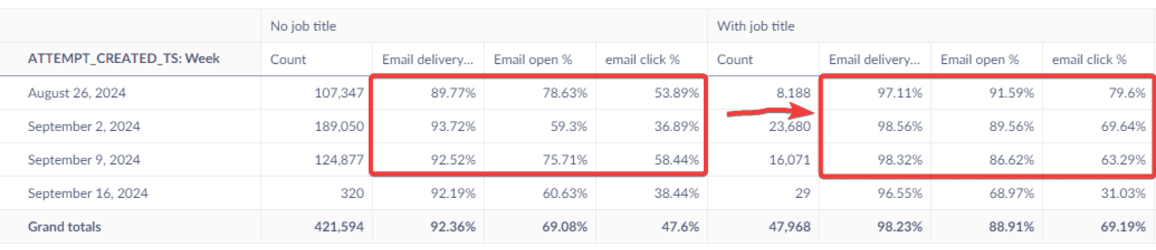
21%
Email click-through
from adding job title + company name to the invite
9%
Welcome-page drop-off
after the page redesign
7%
Intro + setup-flow drop-off
after re-sequencing the flow
Shipped incrementally over ~4 months and measured against a 13-month funnel baseline.

raw funnel export; cleaned for the diagram above
The question
TestGorilla replaces résumé screening with skills assessments. The platform was strong. The journey wasn't.
Our OKR was blunt: get more invited candidates to actually start - from 60% to 80%.
But no one could say where candidates were leaving. So I started with one question:
Why are candidates dropping off?
The answer, once I found it, reframed the whole project:
Our product was built around the database model - not the candidate's mental model.
Every place the two disagreed, a candidate hesitated, got confused, or left.

raw funnel export; cleaned for the diagram above
Mapping the damage
I led the team through a full audit - every screen, every workflow, from invite to results - and rendered it as one journey map.
Seeing it laid out end to end was the turning point. No one had realized how fractured it was.
Then I made it a business problem. I partnered with support and engineering to put a cost on the friction:
30–50% of customer-support calls traced back to candidate usability issues.
50–60% of engineering time went to patching bugs and usability gaps instead of building.
That ended the debate. The redesign got its mandate.

A snapshot of the full journey, mapped screen by screen - the artifact that got the company to act.

Where the funnel broke
I pulled 30,000+ real journeys and mapped every step from invited to completed.
One cliff dwarfed the rest:
Candidates clicked the email - then vanished before the assessment loaded.
84% clicked. Only 57% got in.
A 27-point fall in the gap between "I'm interested" and "I've started." That gap was three screens - the email, the welcome page, and a setup flow - that explained almost nothing and asked for a lot.

What was actually broken
Research made the why undeniable - 21 in-depth interviews across regions, a 3,000-participant survey, and usability sessions.
Three failures, one root cause: we spoke database, candidates spoke human.
Emails gave nothing to hold onto. No job title. No company name. Candidates apply to dozens of roles a week - ours were unidentifiable. And the CTA "Go to assessment" made 67% expect the test to launch on click. It didn't. That surprise was the bounce.
The welcome page had no context. No role, no company, no explanation of what TestGorilla even was. To a first-timer it read as suspicious - not worth their time.
The flow fought the candidate. It asked for a name and email they'd already given. It showed no progress, so no one knew how many steps remained. And it put accessibility setup - extra time, screen readers - dead last, after the timed qualifying questions the candidate needed it for.

Different explorations we did and tested

The redesign
I rebuilt the journey as a single legible path. Every screen now answers the one question a candidate has at that moment: "What happens next - and am I ready?"

The journey we implemented

Process
Every decision was earned, not guessed.
21 in-depth candidate interviews, across regions. 3,000+ survey responses. 8,000+ candidates in A/B tests. Repeated usability sessions - and, later, customer interviews too.
A few decisions and how I tested them:
The CTA. Surveyed candidates on what "Go to assessment" made them expect, then tested alternatives. "Start assessment" won - clearest, least intimidating.
The email. Narrowed 3–4 drafts to 2 by survey, then ran them 50/50 live for three weeks. The winner held a +17% click-through lead and shipped to 100%.
The welcome page. Designed from research, tested think-aloud, iterated - then re-iterated after customer feedback.


Workshops I led
A redesign this broad only sticks if the whole company owns it. So I got them in the room - engineers, PMs, designers, plus IP & science, marketing, support, and sales.
I ran structured sessions using Crazy 8s, SCAMPER, TRIZ, and How-Might-We framing to pull ideas from people who'd never been asked before.
The journey-mapping workshop is what made the problem real - it's where the company first saw how broken the flow was. The design studios put engineers and PMs sketching beside designers, so solutions carried shared ownership.
The lasting outcome wasn't a set of screens. It was a team that started experimenting early - and stopped treating candidate experience as someone else's job.


Reflection
Two lessons I carry into every project since.
Set up the measurement before you build the fix. We had no end-to-end funnel when I joined, so we shipped in the order our gut suggested - intro page, then email, then welcome page. With the full funnel first, I'd have prioritized in almost the reverse order. Now I instrument before I design.
Bring every stakeholder in early - not just the obvious one. "Put talent first" led me to design for candidates and pull employers in late. That cost us a rework cycle on the welcome page. A balanced design needs both voices from day one. When customers did flag concerns, I ran calls with five of them, then iterated to a version that served candidates and employers — but I'd rather have started there.
End Product? A journey that finally makes sense - for the candidate, and the business.